I got a follow-up question in my inbox about this one from a reader:
What’s the investment implication of your inflation chart? Should I own more or less stocks when inflation is higher?
Good question.
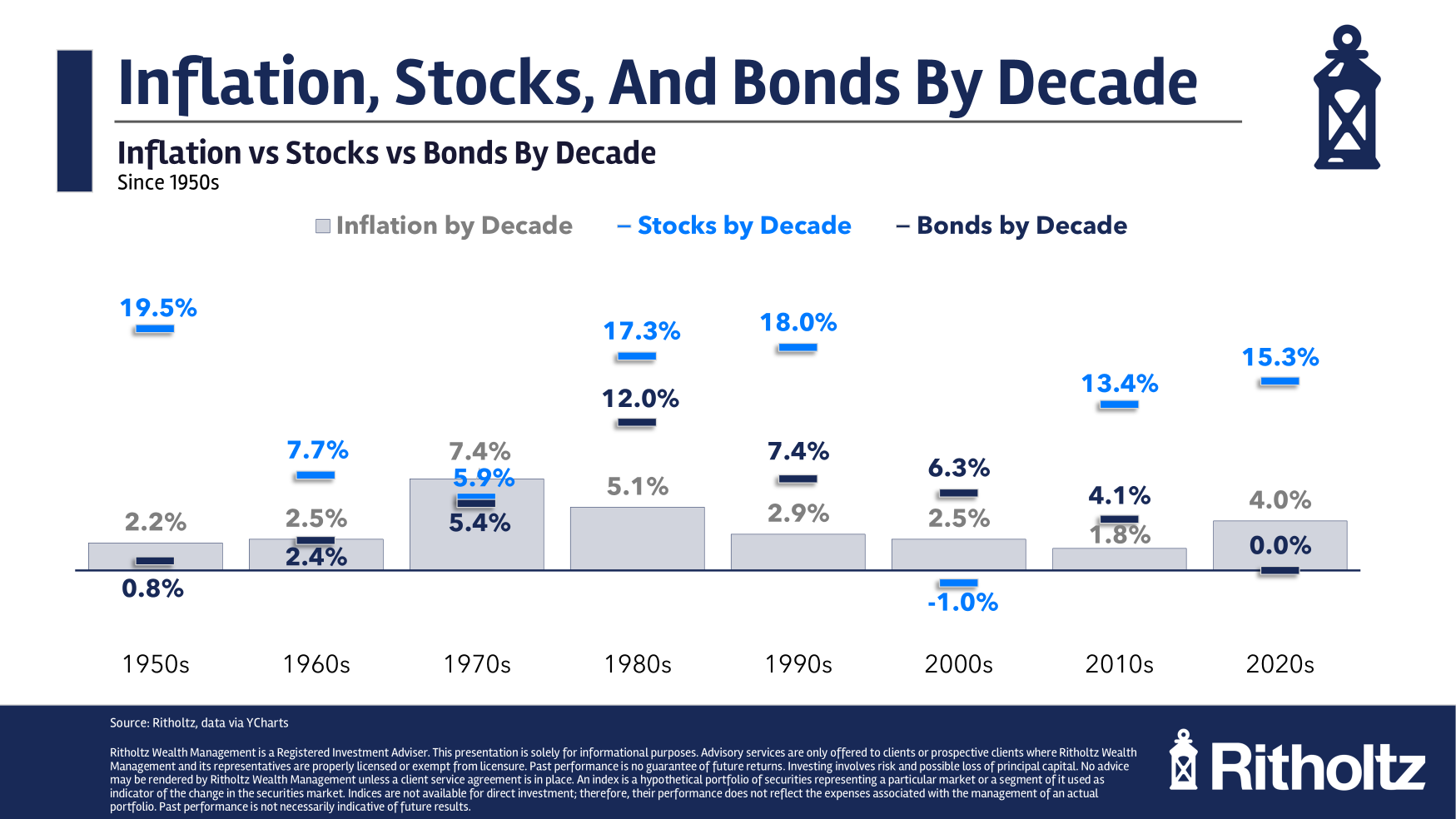
Here’s a follow-up chart with annual stock and bond returns with the corresponding inflation rates:
Higher than average inflation has not hurt the stock market in the 2020s.
Sure, there was the 2022 bear market but this is the highest inflation rate since the 1980s and the stock market is compounding at 15% per year.
The stock market did just fine with relatively high inflation in the 1980s too.
Inflation averaged 5% that decade but the stock market did more than 17% annually.
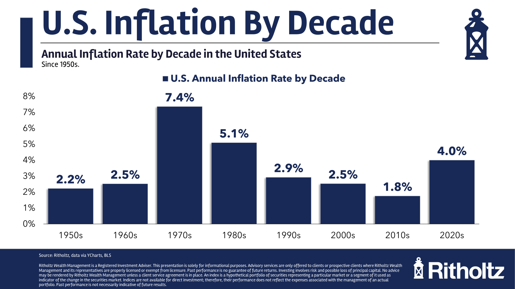
The 1970s is the nightmare scenario where the sky-high inflation gets you. Real returns were negative for the decade.
The difference is that inflation was rising throughout the 1970s and falling from those high levels in the 1980s.
Bonds did similarly well in the 1980s but lagged in the 1970s just like the stock market.
But bonds have taken it on the chin in the 2020s.
Inflation is the biggest risk for government bonds over time but returns for fixed income are also impacted by starting yields and the direction of interest rates.
There’s no simple formula here.
If you’re a glass-is-half-empty person you’ll look at my chart and point to the fact that two of the past eight decades have seen stocks fall behind the inflation rate for a real lost decade.
That’s painful.
The glass-is-half-full version is that the stock market has compounded at 11.7% per year since 1950. Take away the 3.5% average inflation rate in that time and it gives you a real return of 8.2% per year.
More than 8% better than the inflation rate sounds like a pretty darn good long-term hedge to me.
I don’t know if that will repeat over the next 75 years but the stock market remains your best hedge against inflation in the long-run even if that’s not always the case in the short-run.
