Effective log analysis is essential for maintaining the health and performance of modern applications. Amazon OpenSearch Service stands out as a powerful, fully managed solution for log analytics and observability. With its advanced indexing, full-text search, and real-time analytics capabilities, OpenSearch Service makes it possible for organizations to seamlessly ingest, process, and search log data across diverse sources—including AWS services like Amazon CloudWatch, VPC Flow Logs, and more.
With OpenSearch Dashboards, you can turn indexed log data into actionable visualizations that reveal insights and help detect anomalies. By querying data stored in OpenSearch Service, you can extract relevant information and display it using a variety of visualization types—such as line charts, bar graphs, pie charts, heatmaps, and more. These tools make it effortless to monitor system behavior, spot trends, and quickly identify issues in your environment.
This post demonstrates how to harness OpenSearch Dashboards to analyze logs visually and interactively. With this solution, IT administrators, developers, and DevOps engineers can create custom dashboards to monitor system behavior, detect anomalies early, and troubleshoot issues faster through interactive charts and graphs.
Solution overview
In this post, we show how to create an index pattern in OpenSearch Dashboards, create two types of visualizations, and display these visualizations on a custom dashboard. We also demonstrate how to export and import visualizations.
Prerequisites
Before diving into log analysis with OpenSearch Dashboards, you must have the following:
- A properly configured OpenSearch Service domain
- A working log collection and ingestion pipeline
Amazon OpenSearch Service 101: Create your first search application with OpenSearch guides you through setting up your OpenSearch Service domain and configuring the log ingestion pipeline.
For this post, we work with the following log sources, which have already been ingested into an OpenSearch Service cluster as part of the prerequisite steps:
Access OpenSearch Dashboards
Complete the following steps to access OpenSearch Dashboards:
- On the OpenSearch Service console, choose Domains in the navigation pane.
- Check if your domain status shows as Active.
- Choose your domain to open the domain details page.
- Choose the OpenSearch Dashboards URL to open it in a new browser window.
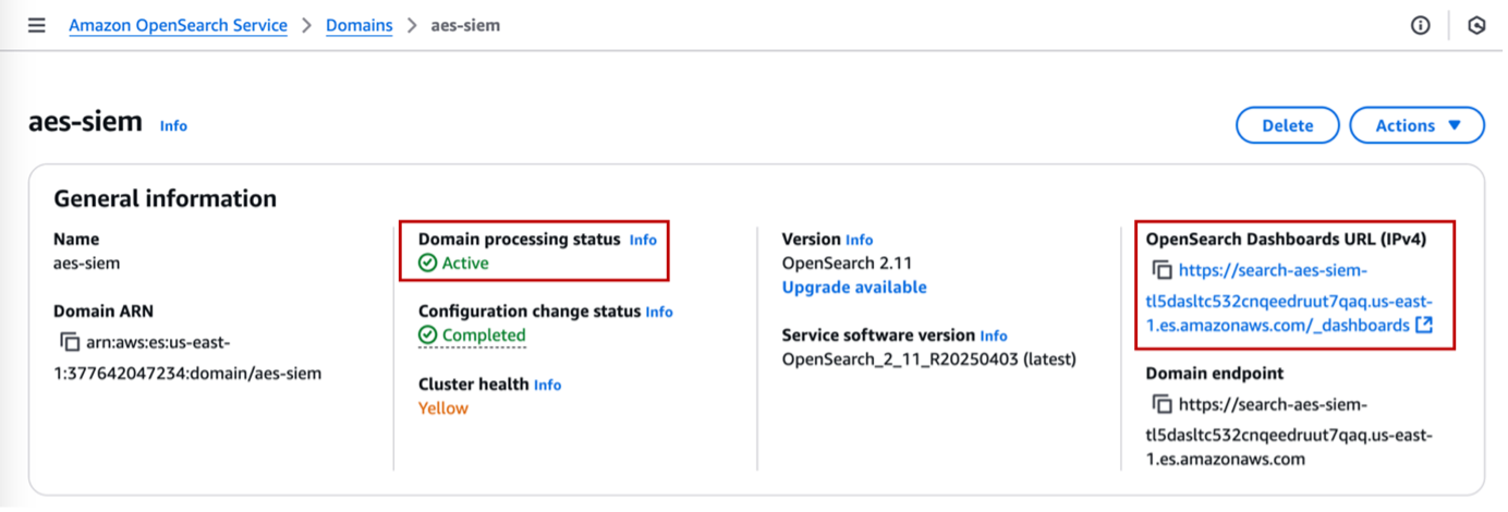
- Authenticate into OpenSearch Dashboards using one of the supported methods.
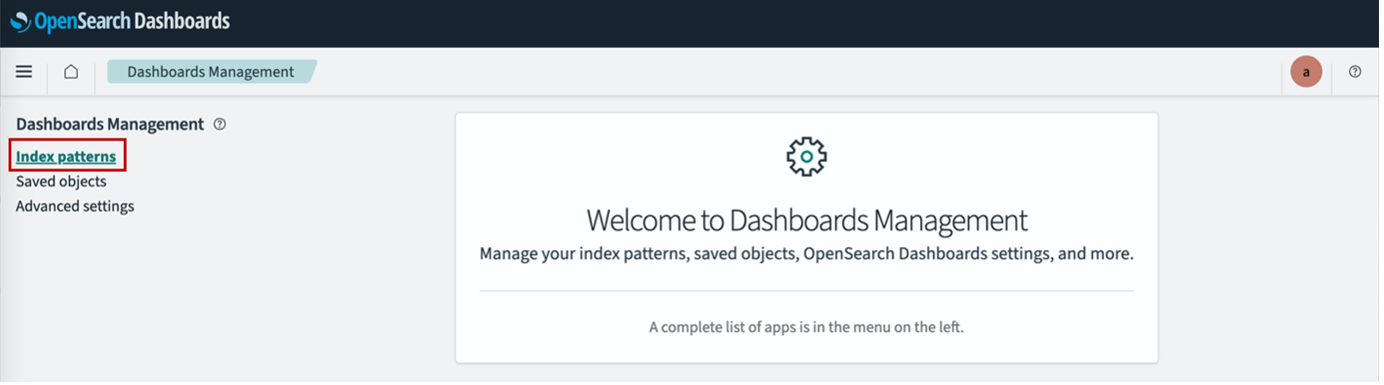
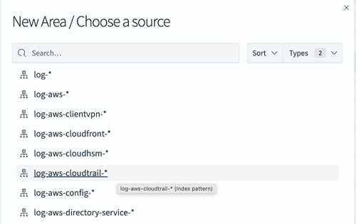
Create an index pattern
After you’re logged in to OpenSearch Dashboards, you must create an index pattern. An index pattern allows OpenSearch Dashboards to locate indexes to search. Complete the following steps
- In OpenSearch Dashboards, expand the navigation pane and choose Dashboard Management under Management.
- Choose Index patterns in the navigation pane.
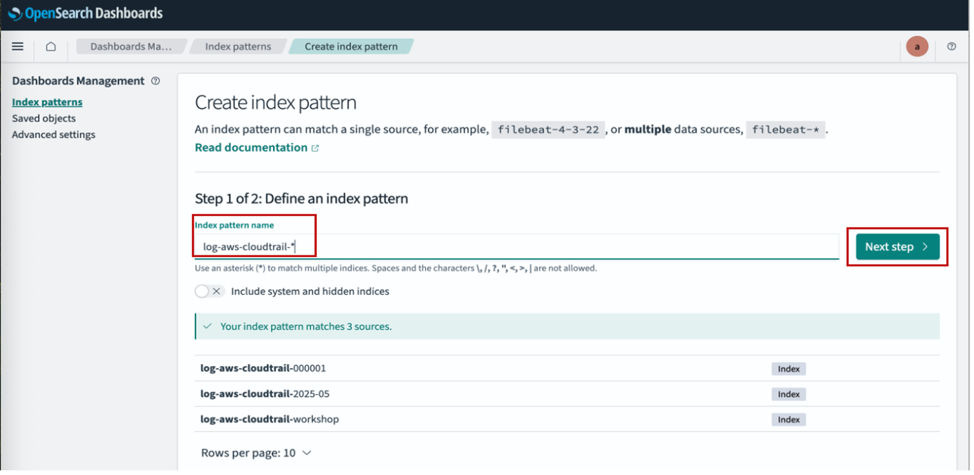
- Choose Create index pattern.
- For Index pattern name, enter a name (for example,
log-aws-cloudtrail-*). - Choose Next step.
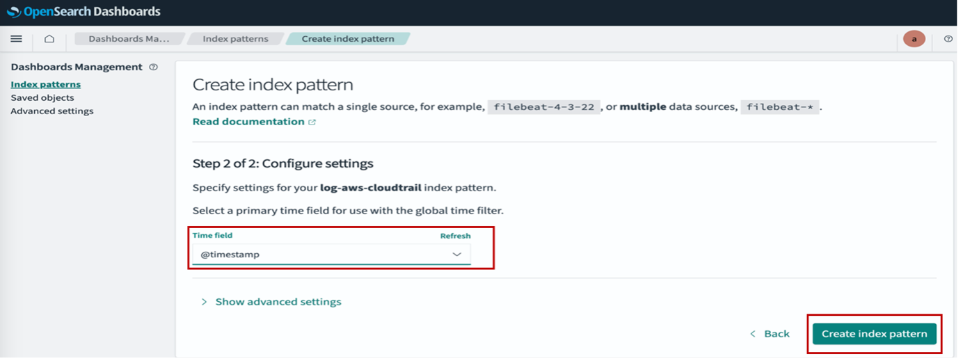
- For Time field¸ choose @timestamp.
- Choose Create index pattern.
Create visualizations
Now that the index pattern is created, let’s create some visualizations. For this post, we create a pie chart and an area graph.
Create a pie chart
Complete the following steps to create a pie chart:
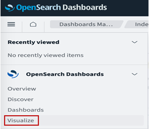
- In OpenSearch Dashboards, choose Visualize in the navigation pane.
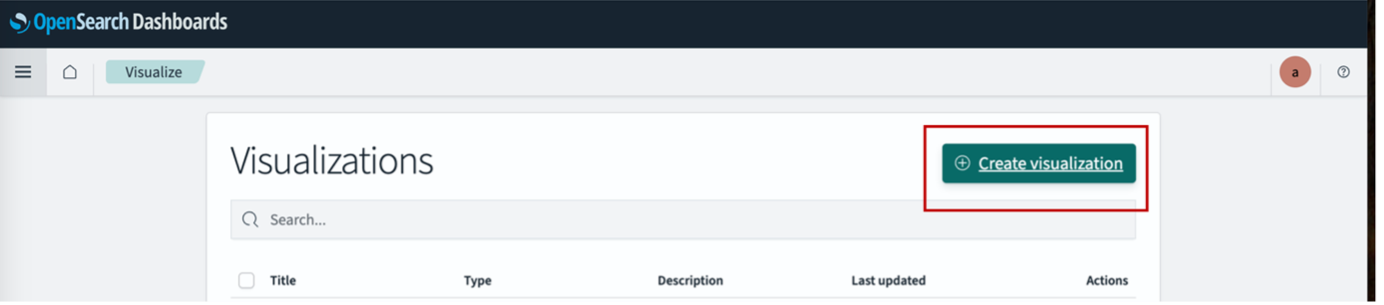
- Choose Create visualization.
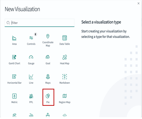
- Choose Pie as the visualization type.
- For Source¸ choose
log-aws-cloudtrail-*.
- Under Buckets¸ choose Add and Split slices.
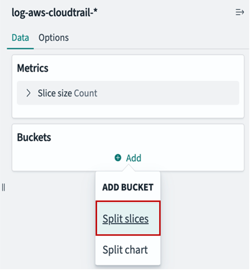
- For Aggregation, choose Terms.
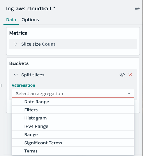
- For Field, choose
eventName. - For Size, enter
10.
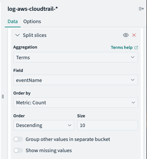
- Leave all other parameters as default and choose Update.
- Choose Save to save the visualization.
Sample ndjson file for the pie chart – EventNamePie.ndjson
Please refer Export and import visualizations for how to import the samples.
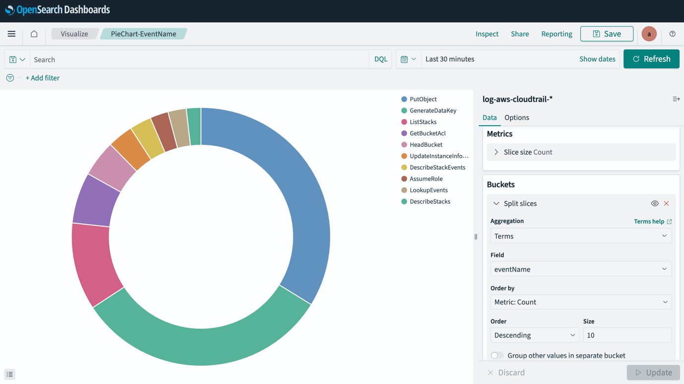
The following screenshot shows our pie chart, which displays different types of events and their occurrence percentage in the last 30 minutes.
Create an area graph
Complete the following steps to create an area graph:
- In OpenSearch Dashboards, choose Visualize in the navigation pane.
- Choose Create visualization.
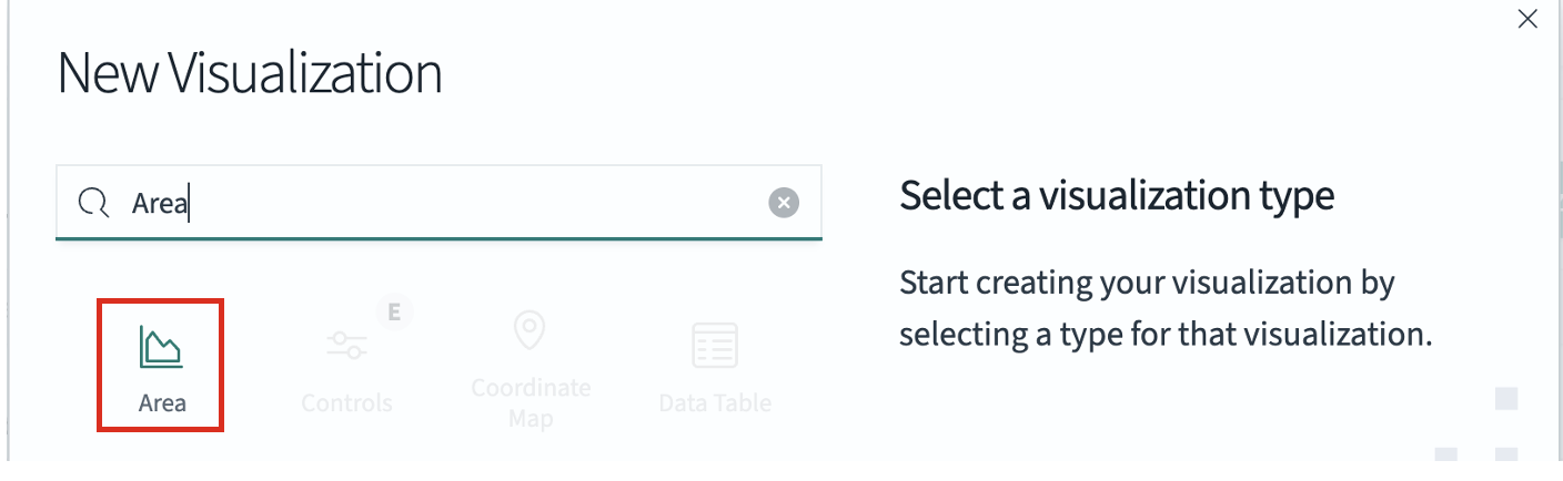
- Choose Area as the visualization type.
- For Source¸ choose
log-aws-cloudtrail-*.
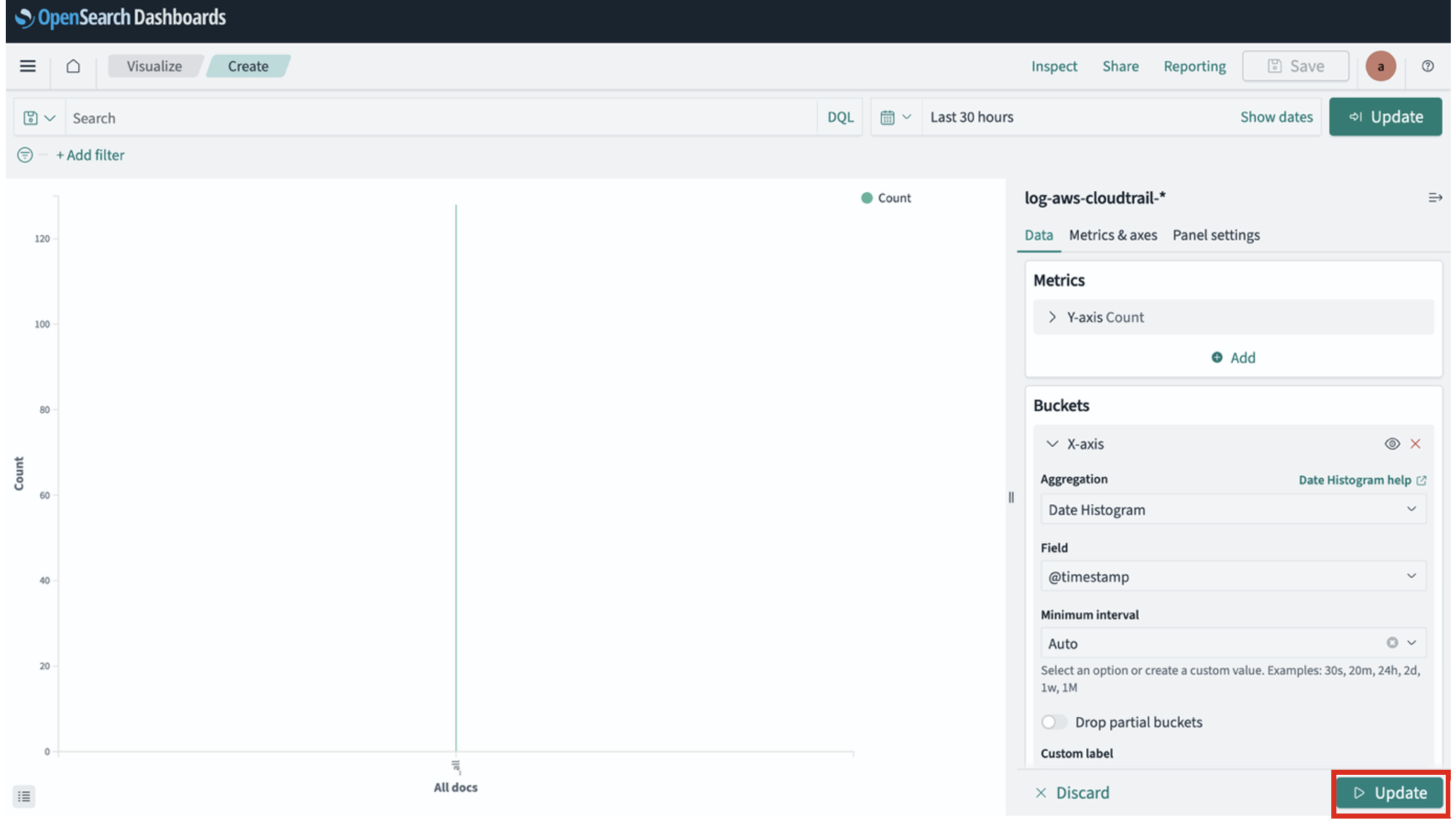
- Under Buckets¸ choose Add and X-axis.
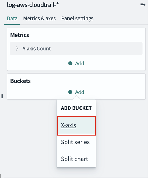
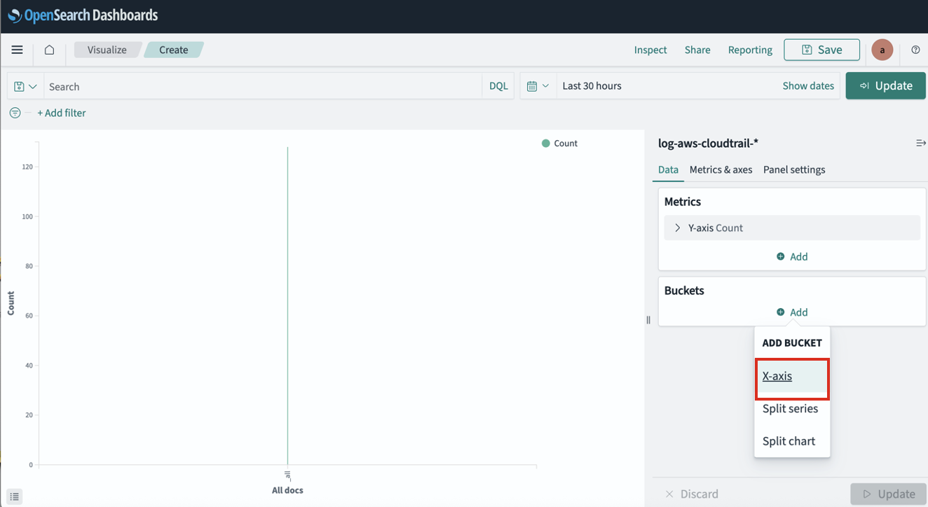
- For Aggregation, choose Date Histogram.
- For Field, choose
@timestamp. - Leave all other parameters as default and choose Update
- Under Advanced¸ choose Add and Split series.
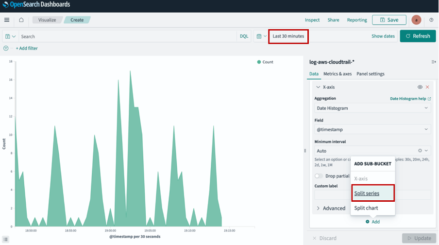
- For Aggregation, choose Terms.
- For Field, choose
eventName. - For Size, enter
10. - Leave all other parameters as default and choose Update.
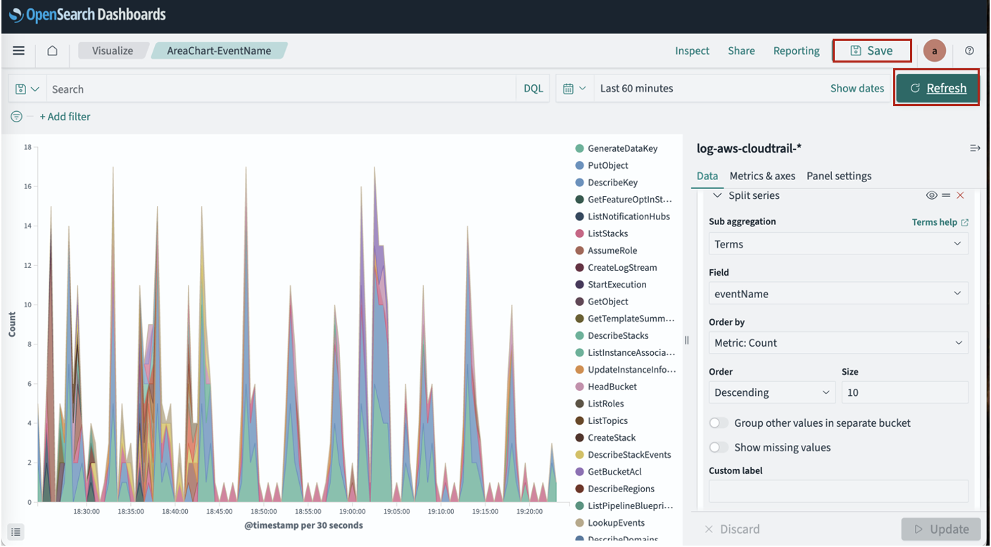
- Choose Save.
- Update the time range to Last 60 minutes.
- Choose Refresh and Save.
The following screenshot shows an area graph with different types of events and their occurrence count in the last 60 minutes.
Sample ndjson file for Area chart – EventNameArea.ndjson
Please refer Export and import visualizations for how to import the samples.
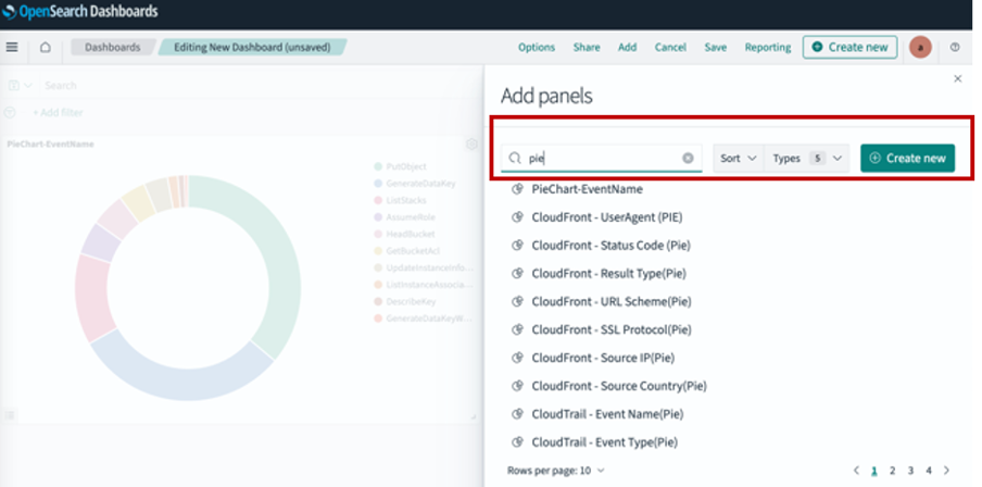
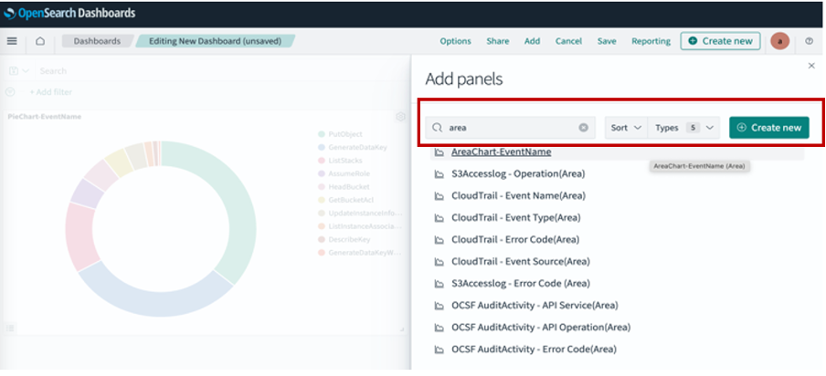
Create a dashboard
Now we will combine the visualizations we just created into a dashboard. A dashboard serves as a customizable interface that consolidates multiple visualizations, saved searches, and various content into a comprehensive view of data. Users can combine diverse visual elements—including charts, graphs, metrics, and tables—into a single cohesive display that can be arranged and resized on a flexible grid layout. You can simultaneously apply filters and time ranges across multiple visualizations, creating a coordinated analytical experience. Complete the following steps to create a dashboard:
- In OpenSearch Dashboards, choose Dashboards in the navigation pane.
- Choose Create new dashboard.
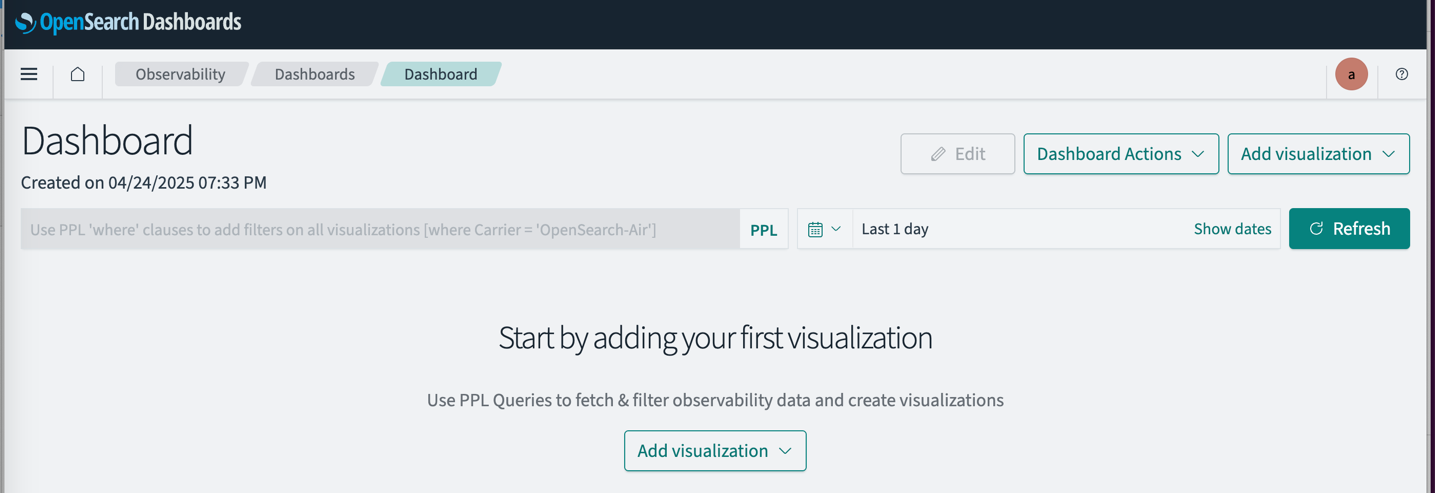
- Choose Add on the menu bar.
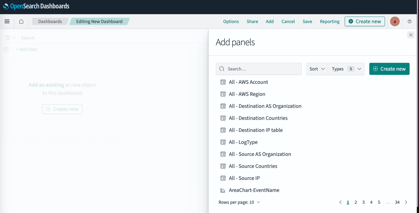
- Search for and choose the visualizations you created.
You can resize panels by dragging their corners to adjust dimensions. To modify the layout arrangement, you can drag the top portion of panels, which allows you to organize them horizontally in a row formation. When working with tabular visualizations, the system provides a convenient option to export your results in CSV format for further analysis or reporting purposes.
- Choose Save.
- Change the time range to Last 60 minutes.
- Choose Refresh and Save.
Sample ndjson file for dashboard – CloudTrailSummary.ndjson
Please refer Export and import visualizations for how to import the samples.
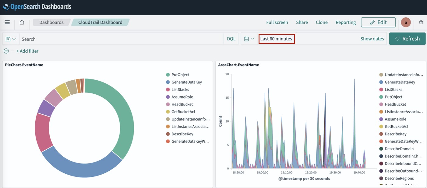
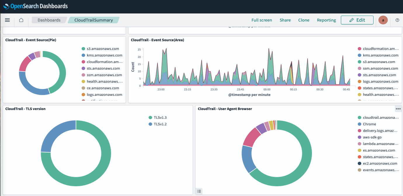
The following screenshot shows the CloudTrail dashboard displaying both visualizations.
Export and import visualizations
In OpenSearch, an NDJSON file is used to import and export saved objects, such as dashboards, visualizations, maps, and index template. The NDJSON file provides a streamlined approach for handling large datasets by representing each JSON object on a separate line. This format enables efficient import/export operations, simplified data migration between environments, and seamless sharing of complex dashboard configurations. Organizations can back up and restore critical visualizations, saved searches, and dashboard settings while maintaining their integrity. The format’s structure reduces memory overhead during large transfers and improves processing speed for bulk operations. NDJSON’s human-readable nature also facilitates troubleshooting and manual editing when necessary, making it an invaluable tool for maintaining OpenSearch Dashboards deployments across development, testing, and production environments.
Export a visualization
Complete the following steps to export a visualization:
- In OpenSearch Dashboards, choose Saved objects in the navigation pane.
- Search for and select your object (in this case, a visualization), then choose Export.
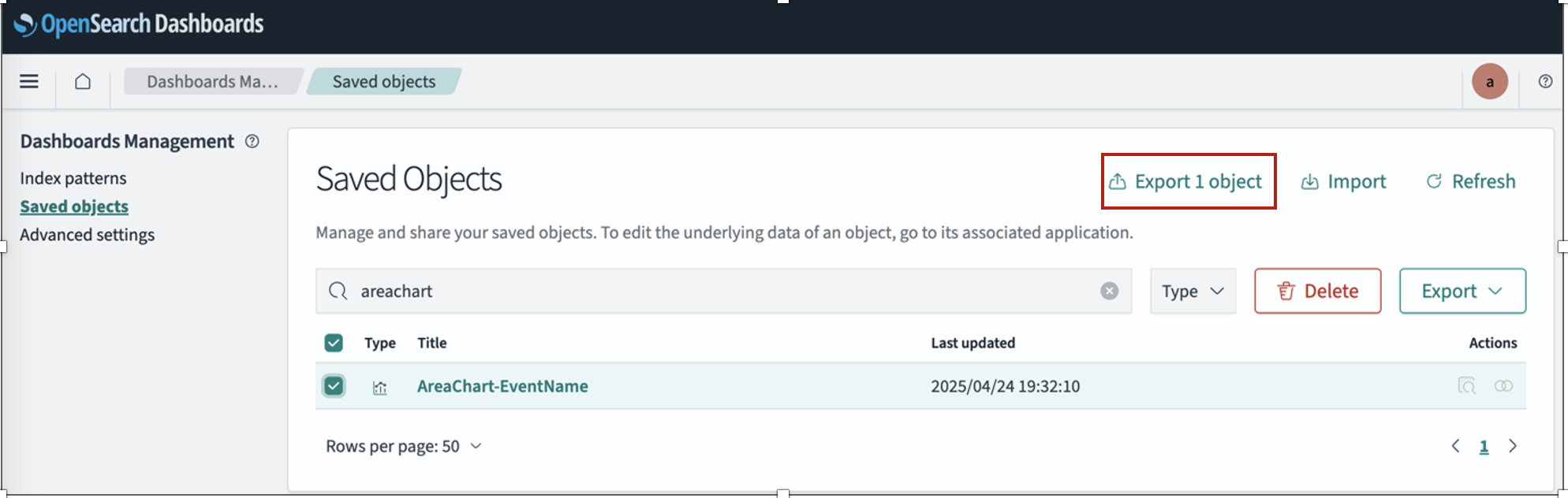
The NDJSON file is downloaded in your local host.
Import a visualization
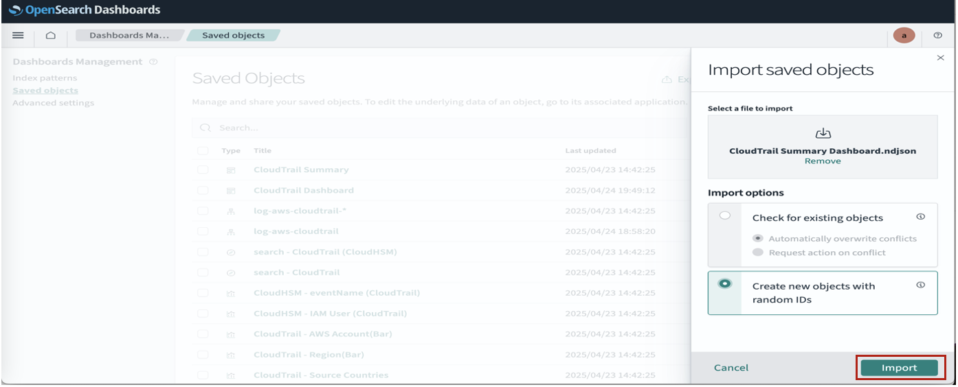
Complete the following steps to import a visualization:
- In OpenSearch Dashboards, choose Saved objects in the navigation pane.
- Choose Import.
- Choose the first NDJSON file to be imported from your local host.
- Select Create new objects with random IDs.
- Choose Import.
- Choose Done.
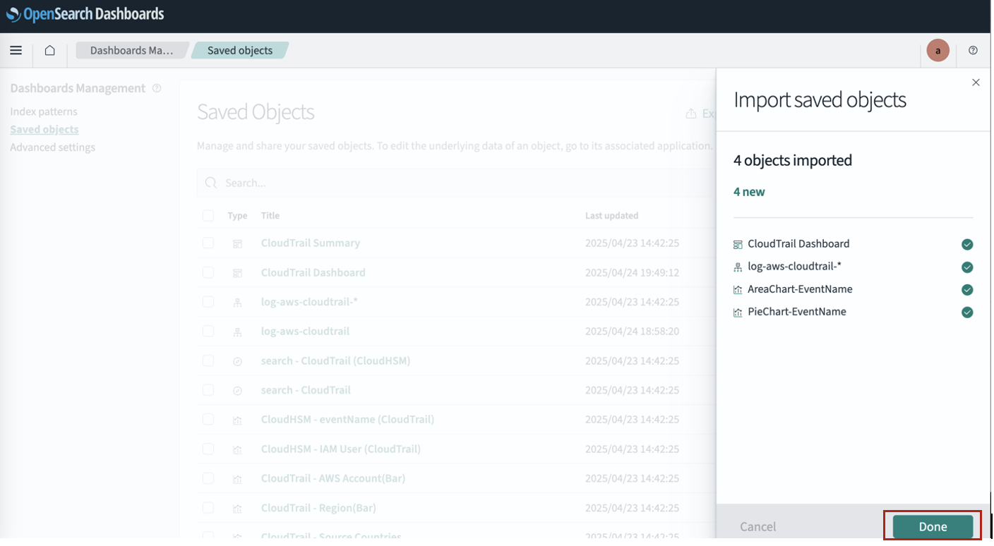
- Choose Import.

You can now open the imported object.
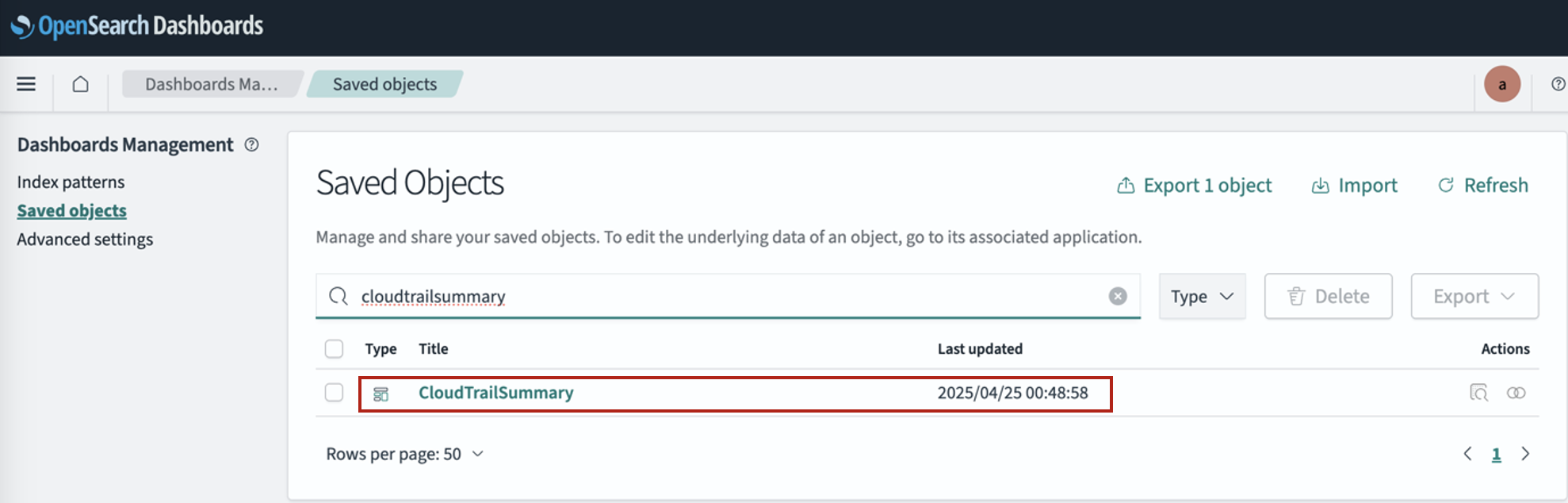
The following screenshot shows our updated dashboard.
Clean up
To clean up your resources, delete the OpenSearch Service domain and relevant information stored or visualizations created on the domain. You will not be able to recover the data after you delete it.
- On the OpenSearch Service console, choose Domains in the navigation pane.
- Select the domain you created and choose Delete.
Conclusion
OpenSearch Dashboards is a powerful tool for transforming raw log data into actionable visualizations that drive insights and decision-making. In this post, we’ve shown how to create visualizations like pie charts and area graphs, build comprehensive dashboards, and efficiently export and import your work using NDJSON files. By using the fully managed OpenSearch Service features, organizations can focus on extracting valuable insights rather than managing infrastructure, ultimately enhancing their observability posture and operational efficiency.
To further enhance your OpenSearch proficiency, consider exploring advanced visualization options such as heat maps, gauge charts, and geographic maps that can represent your data in more specialized ways. Implementing automated alerting based on predefined thresholds will help you proactively identify anomalies before they become critical issues. You can also use OpenSearch’s powerful machine learning capabilities for sophisticated anomaly detection and predictive analytics to gain deeper insights from your log data. As your implementation grows, customizing security settings with fine-grained access controls will provide appropriate data visibility across different teams in your organization.
For comprehensive learning resources, refer to the Amazon OpenSearch Service Developer Guide, watch Create your first OpenSearch Dashboard on YouTube, explore best practices in Amazon OpenSearch blog posts, and gain hands-on experience through workshops available in AWS Workshops.
About the Authors
 Smita Singh is a Senior Solutions Architect at AWS. She focuses on defining technical strategic vision and works on architecture, design, and implementation of modern, scalable platforms for large-scale global enterprises and SaaS providers. She is a data, analytics, and generative AI enthusiast and is passionate about building innovative, highly scalable, resilient, fault-tolerant, self-healing, multi-tenant platform solutions and accelerators.
 Dipayan Sarkar is a Specialist Solutions Architect for Analytics at AWS, where he helps customers modernize their data platform using AWS analytics services. He works with customers to design and build analytics solutions, enabling businesses to make data-driven decisions.